Copia
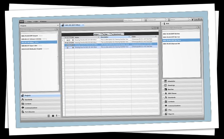
Engraph is a software development company who was building a suite of tools for the heating and cooling industry. Pictured here is the creative mock-up of the CCS (Construction Coordination Software), the main title in the suite.
I was responsible for gathering requirements of each section of the software, and drawing out screen layout, user interface controls, icons, typography and color.
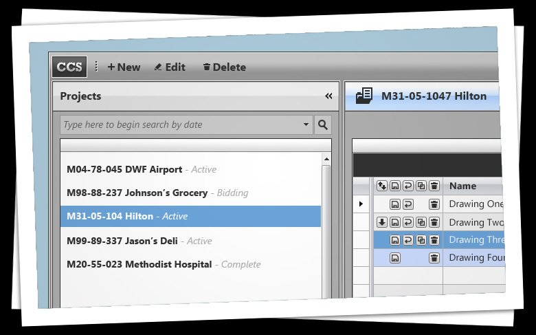
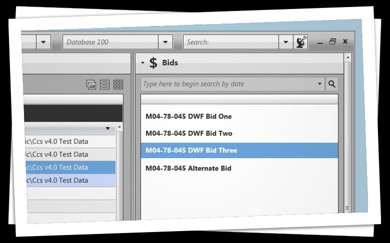
I used a Adobe Photoshop CS4 and Expression Design 4 for pixel and vector graphics. I then produced XAML controls and icons in Expression Blend 4, basic ideas were developed with SketchFlow. Shown here is the completed user interface design in high fidelity.
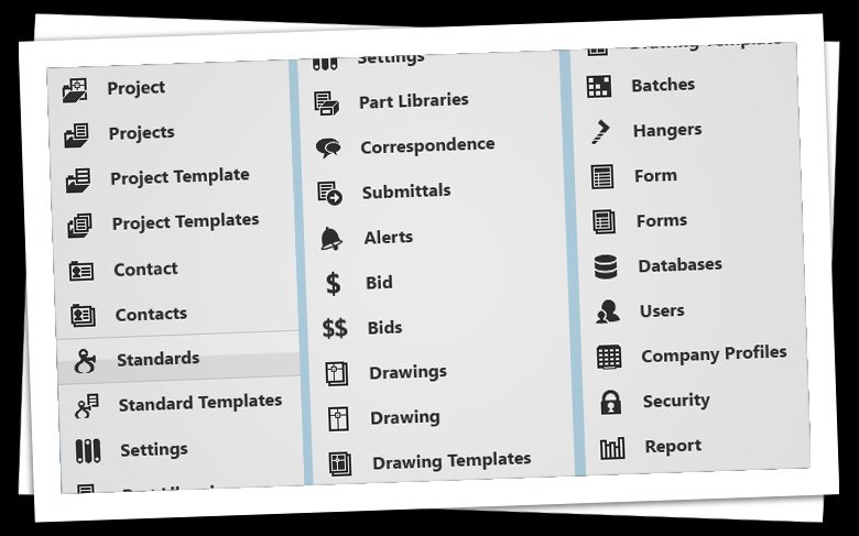
For speed, control libraries such as Telerik were employed by developers. I provided creative assets for their customization.
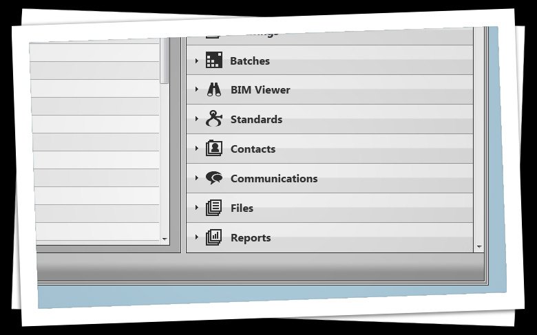
While designing the icons, I was very pleased with the visual analogies, especially for standards. The hard edges and metallic color scheme made references to the sheet metal used in the heating and cooling industry.
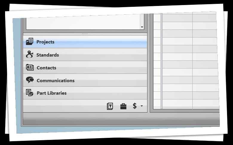
I was very pleased with Microsoft's typography for the font Segoe UI. I found Segoe explained in detail on MSDN, and was glad to find it an excellent resource.
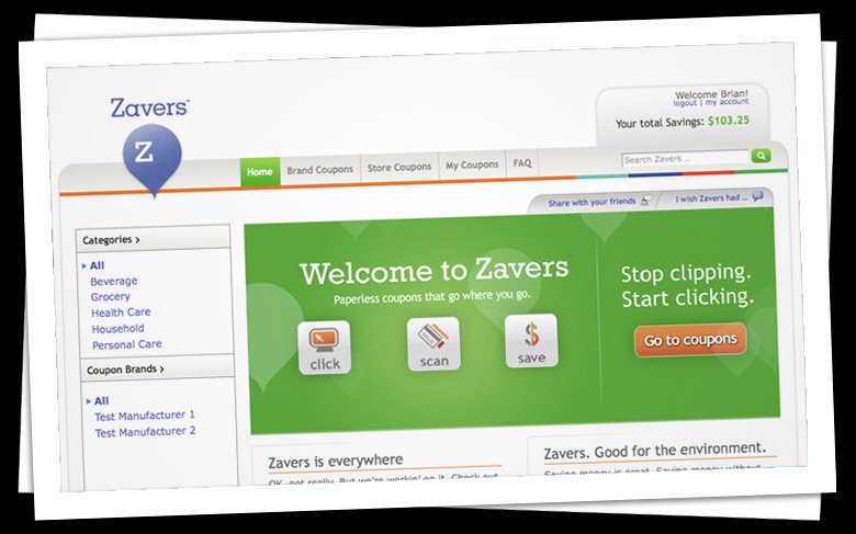
Zavers.com is a digital coupon site that has the unique ability to have the coupons you clip online to be automatically added to your loyalty card at the point of sale.
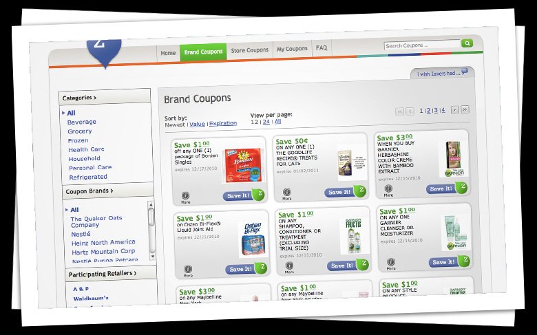
A view of coupons available for the user. Coupons could also be used in targeted ads outside the Zavers website, such as the front page of your local newspaper's online edition.
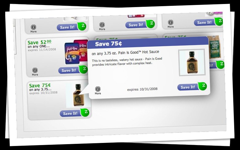
Lightboxes (or modal windows) allowed the user to gain more information about the savings or the product.
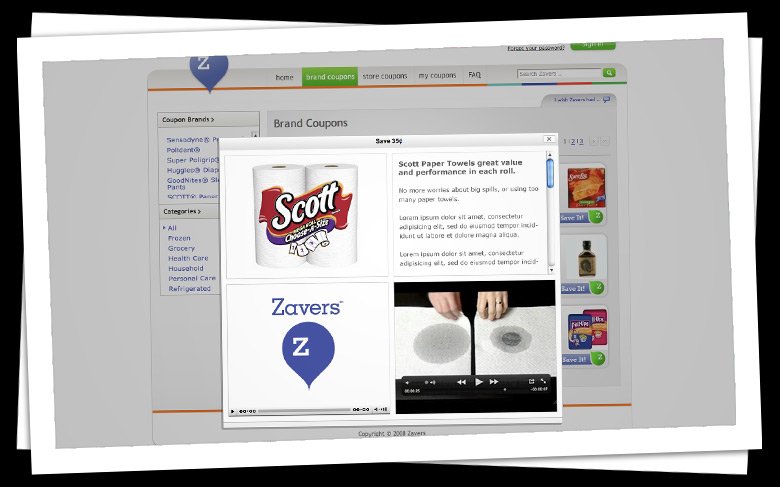
In fact, not only coupon information, but all media could be present. Prodcut images, audio from radio campaigns, video from television campaigns.
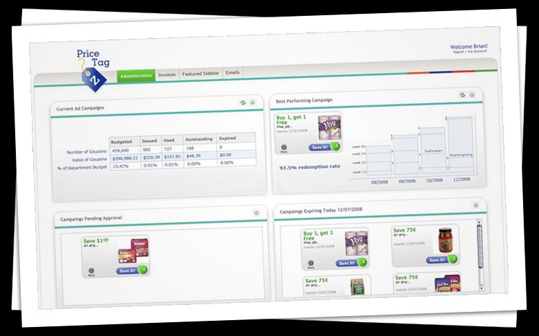
Price was my suggestion to differentiate the consumer website from the vast online administration where manufacturer's and retailers would make coupons campaigns together.
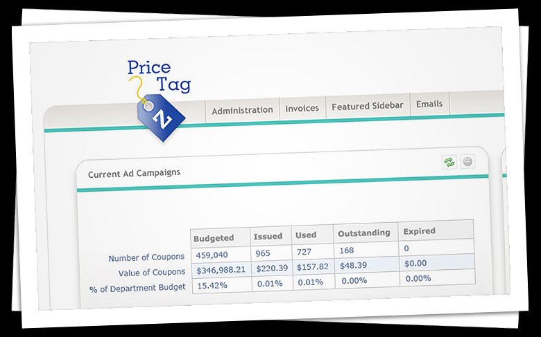
In the Price Tag application, the user was greeted with a customizable dashboard
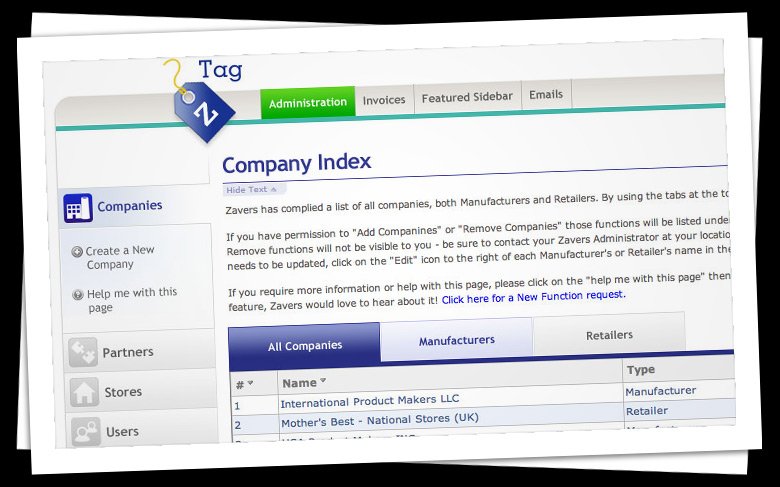
Clear instructions were available on each page but could easily be hidden away for future use. A help menu was always in context of the page functions on the left.
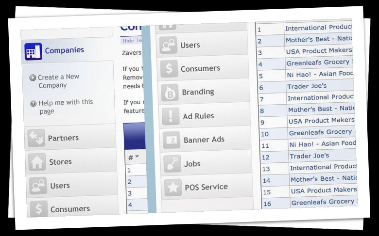
Strong icons to guide the users through each task.